Everyone is guilty of it. And as more content is published at incalculable speed, content consumers are often found to be in a dazed scroll-loop giving less attention to everything on their screen.
Structuring your content within the natural habitat of the channel is far more crucial. Why does it matter? Brands spend millions on marketing to send their message across the digital world, but reach without actual consumption of content by the user leads to lesser engagement, business outcomes, and higher ad costs.
Now that we know the problem, how can we overcome it? Let’s begin with an experiment.
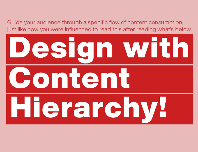
What’s the first piece of text you read from the image?
Structuring content systematically, where content consumers are guided effortlessly through the piece of content, providing a greater possibility for your content to be a scroll-stopper.
A common misconception brands have towards content and content producers is to make everything bigger. “Make the logo bigger. Make the price bigger. Make the image bigger.” While bigger is better, nothing is important when everything is important
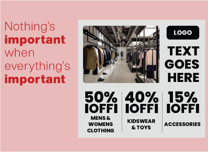
For instance, here are two examples of content with and without content hierarchy.
As a content consumer, which post are you most likely to stop, read and resume scrolling?
One of the posts has all the information required about the product, while the other is strategically placed based on the importance of information and the influence imparted on the audience demographic.


What is Content Hierarchy?
Content hierarchy is the strategic placement and visualisation of content based on the importance and influence it has on your audiences and your objective behind the content that is being created. While there are many ways and strategies to overcome content blindness, here are few parameters when it comes to using content hierarchy to overcome it.
01 Content Framing
“How you say it” sometimes makes a world of difference to how “what you were saying” was perceived by your audience”.Frames are storylines that create relevance between your message, your audience and the action you want to trigger amongst the audience.

02. Size and proportions
To communicate your message effectively on various social media channels, applying a little design principle is necessary. It is also essential that the size and proportions are altered to be seamlessly consumed on mobile devices, especially since that’s where majority of the digital content consumption happens.
03. Colour and contrast
Believe it or not, colour psychology plays an enormous role in setting the mood and influencing decisions. In fact, there’s a study done exclusively on how colour affects consumer behaviour.Associating the right colour with your message can take your content a long way. Some colours work best on digital channels, while some are overlooked.
Remember, it’s always important that you consider culture related to the audience and personas since it’s not a “one size fits all” approach when it comes to colour.
04. Placements and position
As humans, our eyes are effectively programmed to scan a certain page in a certain way. People rarely read content word by word. Instead, they scan the content, picking out individual words and sentences.
Understanding this scanning behaviour gives you an edge when it comes to placing your message in the logical path of content consumption, thus ensuring that your message is communicated effectively. Content that can be scanned easily tends to acquire more engagement/content consumption.
05. Utilization of blank/white space
In the same way that music requires space for each individual note, and a symphony to be enjoyed by everyone, design also requires space. Music without space is noise, and design without space is a crowd. By controlling white/empty space in design, you create direction and motion to influence consumers positively.
06.Directionality
Directionality of content either helps the order of information or hinders it. Hence, getting this right is crucial when it comes to creating a good content hierarchy. Directionality is much about the orchestration of content framing, typography, colour, placements, positions, and proportions in harmony, ensuring a seamless flow of content consumption that is designed precisely to induce actions/emotions.
You can also use the directionality of placement to make specific parts of content stand out. Content Hierarchy is not the only crucial element to create scroll-stopping content, but a vital element. Each of the factors mentioned above are topics in itself and is only a surface-level explanation to guide the reader to understand how they play a key role in creating Content Hierarchy.
About the Author

Hisham Zulfiqar
Co-Founder Digibrush
Co-Founder Hiperlogy Singapore
Hisham is the co-founder of Digibrush, a design and digital agency with over 75 people based in Sri Lanka and Singapore. He has over 10+ years of industry experience in conceptualising and executing digital campaigns for multiple industries including Telco, F&B- App Marketing, E-Commerce etc.